


Stop! Alternative Tip for Tricking Outlook
To get around this quirk, you could also use conditional code to trick Outlook into thinking that you have closed a cell and opened a new one. After the closing tag of your first table, and before the opening table tag for your second, simply add:
1
2
3
<!--[if mso]>
</td><td>
<![endif]-->
1
2
3
| <!--[if mso]> </td><td><![endif]--> |
Carry on..
On the wider, right-hand table, we're going to use the same approach we used on our container table, which involves creating a class and adding the conditional wrapper code too. We want this table to be 100% wide on mobile, where it will pop down below the table on the left.
01
02
03
04
05
06
07
08
09
10
11
12
13
14
15
16
| <!--[if (gte mso 9)|(IE)]><table width="425" align="left" cellpadding="0" cellspacing="0" border="0"> <tr> <td> <![endif]--> <table class="col425" align="left" border="0" cellpadding="0" cellspacing="0" style="width: 100%; max-width: 425px;">style="width: 100%; max-width: 425px;"> <tr> <td height="70"> </td> </tr> </table> <!--[if (gte mso 9)|(IE)]> </td> </tr></table><![endif]--> |
Here you can see that I have created a class called 'col425' for this table, our 425px wide column. I've wrapped the table in the conditional code that will enclose it in a 425px wide table. We then add our class to the Media Query that we created for Apple Mail too.
1
| .col425 {width: 425px!important;} |
Now inside our cell we'll add the styled heading.
01
02
03
04
05
06
07
08
09
10
11
12
| <table width="100%" border="0" cellspacing="0" cellpadding="0"> <tr> <td class="subhead" style="padding: 0 0 0 3px;"> CREATING </td> </tr> <tr> <td class="h1" style="padding: 5px 0 0 0;"> Responsive Email Magic </td> </tr></table> |
I've added some classes to each cell for styling, as well as some styles I'll be using for other text types later on:
1
2
3
| .subhead {font-size: 15px; color: #ffffff; font-family: sans-serif; letter-spacing: 10px;}.h1 {font-size: 33px; line-height: 38px; font-weight: bold;}.h1, .h2, .bodycopy {color: #153643; font-family: sans-serif;} |
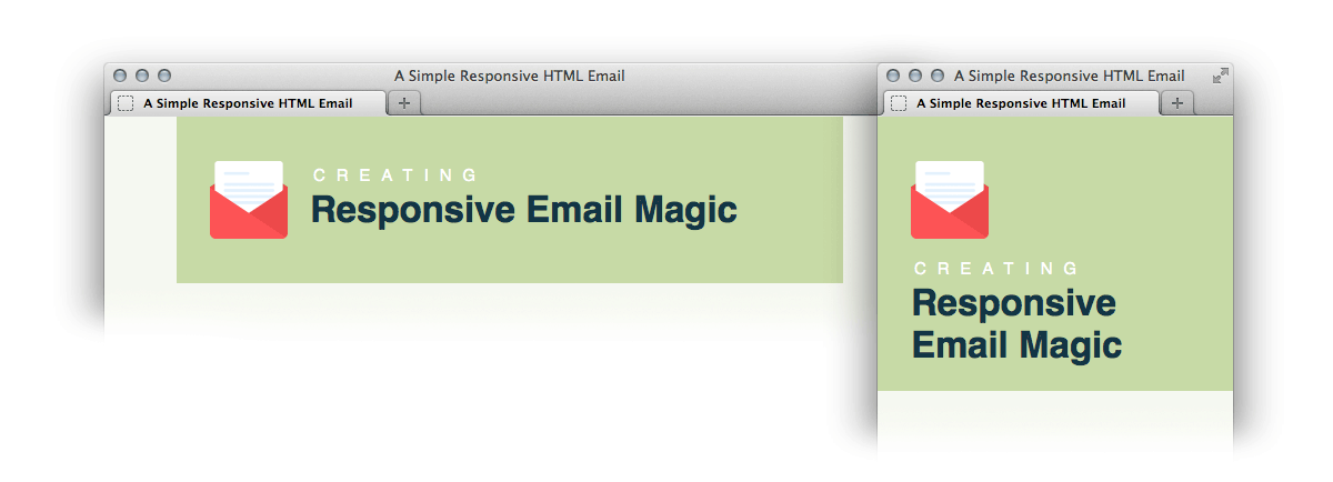
Our header is now complete, and you can see below how the two columns will stack on mobile. (To preview this while you work, you'll need to temporarily comment out the min-device-width media queries, because they are enforcing a fixed width on desktop).
Creating the Single Column Text Row
To create a single column text row, we simply add a new row to our '.content' table. We'll add an 'innerpadding' class to these rows with some reusable padding values. We'll also add a class of 'borderbottom' to apply a border to each row.
01
02
03
04
05
06
07
08
09
10
11
12
13
14
15
16
| <tr> <td class="innerpadding borderbottom"> <table width="100%" border="0" cellspacing="0" cellpadding="0"> <tr> <td class="h2"> Welcome to our responsive email! </td> </tr> <tr> <td class="bodycopy"> Lorem ipsum dolor sit amet, consectetur adipiscing elit. In tempus adipiscing felis, sit amet blandit ipsum volutpat sed. Morbi porttitor, eget accumsan dictum, nisi libero ultricies ipsum, in posuere mauris neque at erat. </td> </tr> </table> </td></tr> |
Our CSS for this section:
1
2
3
4
| .innerpadding {padding: 30px 30px 30px 30px;}.borderbottom {border-bottom: 1px solid #f2eeed;}.h2 {padding: 0 0 15px 0; font-size: 24px; line-height: 28px; font-weight: bold;}.bodycopy {font-size: 16px; line-height: 22px;} |
Creating the Double Column Article
Now we'll create a responsive row exactly like our header, but with slightly different dimensions so that we can have a larger image.
01
02
03
04
05
06
07
08
09
10
11
12
13
14
15
16
17
18
19
20
21
22
23
24
25
26
27
28
29
30
31
32
33
34
35
36
37
38
39
40
41
42
43
44
45
| <tr> <td class="innerpadding borderbottom"> <table width="115" align="left" border="0" cellpadding="0" cellspacing="0"> <tr> <td height="115" style="padding: 0 20px 20px 0;"> <img src="images/article1.png" width="115" height="115" border="0" alt="" /> </td> </tr> </table> <!--[if (gte mso 9)|(IE)]> <table width="380" align="left" cellpadding="0" cellspacing="0" border="0"> <tr> <td> <![endif]--> <table class="col380" align="left" border="0" cellpadding="0" cellspacing="0" style="width: 100%; max-width: 380px;"> <tr> <td> <table width="100%" border="0" cellspacing="0" cellpadding="0"> <tr> <td class="bodycopy"> Lorem ipsum dolor sit amet, consectetur adipiscing elit. In tempus adipiscing felis, sit amet blandit ipsum volutpat sed. Morbi porttitor, eget accumsan dictum, nisi libero ultricies ipsum, in posuere mauris neque at erat. </td> </tr> <tr> <td style="padding: 20px 0 0 0;"> <table class="buttonwrapper" bgcolor="#e05443" border="0" cellspacing="0" cellpadding="0"> <tr> <td class="button" height="45"> <a href="#">Claim yours!</a> </td> </tr> </table> </td> </tr> </table> </td> </tr> </table> <!--[if (gte mso 9)|(IE)]> </td> </tr> </table> <![endif]--> </td></tr> |
We've added a button here with the class 'buttonwrapper'. It contains a padded cell with a background colour set, and then a text link inside. I prefer to use this method as it allows you to have fluid width buttons which is very useful when creating a reusable template, where the width of every button will be different each time it is used. If you have a fixed width for your buttons you may prefer to use the Bulletproof Button Generator over at Campaign Monitor.
Our styles for the button:
1
2
| .button {text-align: center; font-size: 18px; font-family: sans-serif; font-weight: bold; padding: 0 30px 0 30px;}.button a {color: #ffffff; text-decoration: none;} |
As well as our set width for this new class 'col380', we'll add our size to our list of styles to take care of Apple Mail. It now looks like this:
1
2
3
4
5
| @media only screen and (min-device-width: 601px) {.content {width: 600px !important;}.col425 {width: 425px!important;}.col380 {width: 380px!important;}} |

0 comments:
Post a Comment